Responsive Web Design Services – Two Basic Principles to Rock Your Website
Users are always moving. Most of the website visits begin on the mobile device. As per the prediction of eMarketer, MCommerce sales for US retail is going to increase in the upcoming years. It is going to quadruple. As a result, it has become necessary to optimize your website accessibility in order to make your business stay relevant. To accommodate users flexibly, it is better to choose responsive web designs.

It is an approach
to web development by which developers plan, design and developer to
make appear optimally in all type of devices. Appear optimally means
something that is readable, easily navigable and usable with minimal
panning and scrolling. It is not a method, but a fundamental idea to
design or built your website.
Responsive design
is a front-end development process intended for molding website
design and user experience to various devices from desktop to mobile.
In a responsive
and a cascading style sheet, it essentially tells what defines the
format and layout of a web page. Generally, it leverages to permit a
website to scale to the width of a browser, independent of the type
of device used. Along with a responsive design, you are going to find
certain things in common such as -
JavaScript
and JS libraries such as jQuery and Modernizr to resize more objects
that are dynamic just like masonry galleries as well as converting
mouse activities to touch.

In the adaptive
designs or mobile detection, they leverage device detection, which
responsive design elements do not perform. Rather than making queries
on the device type with backend logic, CSS media queries helps to
determine things like the width and orientation of the screen.
Two Basics of
Responsive Design
Here we are going
to discuss the two basic principles of responsive design that every
web design services must provide. We are going to talk all about
breakpoints and fluidity –
Breakpoints
CSS3 media
queries are able to create unconditional boundaries at which the
width of the specific device type will trigger alternate styles. At
our web
design services in India, we prefer to use a maximum width
breakpoint, to create a desktop first beside minimum-width boundary,
for a mobile-first design. Queries are also in use to determine the
height and device orientation.
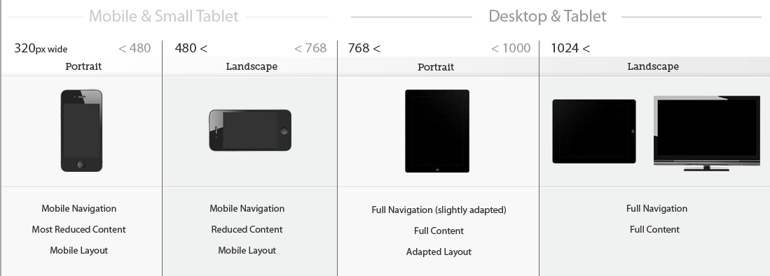
You can set the
breakpoint size in PX or EM. The differentiation of the modern
browsers is negligible compared to something that was visible few
years back. Breakpoints can be set at any size, but they tend to
align with the common dimensions such as Desktop, Tablet Portrait,
Mobile Landscape, and Mobile Portrait. These tend to be 1200/960px,
768px, 480px, and 320px, wide respectively. However, industry
standards keep on changing since every day new devices will be
available in the market.
Over the years,
we have seen that devices have begun to blend into one another. After
the launch of retina displays by iOS devices, it is a popular element
to look for new possibility. As a result, you will find that two or
more device have the same breakpoint. Even a particular device has a
unique size, so where you will find the application of our next
principle.
Fluidity
You can achieve
fluid scaling in a few ways, but at the same time, it involves a
percentage or EM values to permit the container to scale within the
bounds of its parent elements, and ultimately the browser. Fluid
scaling is important as it helps to achieve responsiveness between
the breakpoints, maximize the real estate, and maintain the flow of
columns in a responsive grid.
The best and
simple example of fluidly scaling object would be an HTML page that
consists of one block with a width of 100% and a height of “auto”.
As we know that, the browser changes their width and block scales it
proportionally. You can choose to apply this granular level, but
fluidity should exist at the top level of any responsive container.

Yet another great
example of fluidity is the grid layout. You will find in the grid
layouts, aligned virtual blocks, evenly distributed over the width of
the body of a site or container. These blocks are having fixed-width,
aligned as inline blocks, with a parent container that is fluidly
scaling. When the browsers reach a point where the sum of all blocks
exceed each block and represent a number of columns, it breaks away.
Say if you have
three blocks, they represent 9 columns and as soon as you scale down
to a width that fits 2 blocks, 3 columns each, with the 3rd on the
next row. You will now look at an eight-column layout, with 2 columns
of margin. You must scale further to close the margin and you will
look at a six column without any margin.


Comments
Post a Comment